
Updated
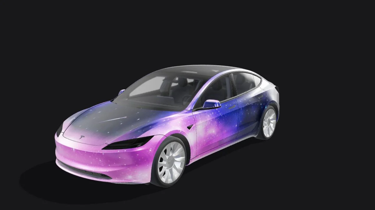
A strong digital wrap has one recognizable idea that still reads when the vehicle appears small on a screen. Choose a main color, one accent and a focal area before collecting more details. The six directions below are design exercises for Paint Shop; they do not rank real-world vinyl finishes or reproduce other creators’ work.
| Style | Focal area | First check |
|---|---|---|
| Two-tone | Hood or lower body | Balance from front and side |
| Racing stripes | One broad stripe and a small accent | Panel alignment |
| Topographic lines | Large contour groups | Readability at normal preview size |
| Geometric blocks | Two or three large shapes | Corners and seams |
| Botanical | A limited repeated motif | Density near panel edges |
| Night sky | Dark base with a few bright accents | Contrast and texture noise |
Two-tone: make the silhouette do the work
Choose two clearly different values, such as a pale body with a dark hood. Keep the first version free of texture so you can judge the distribution of color. Review the front and side together: a large dark hood may feel balanced head-on but disconnected from the doors. Repeat a small amount of the dark color near the rear if needed. Build this with separate shapes or panel fills so later changes remain simple.
Racing stripes: align a few large elements
Start with a broad stripe on the hood and a simpler continuation on adjacent panels. Use a second, narrow accent only after the main line reads correctly in 3D. UV islands are separated and can be rotated, so a straight line on the sheet is not necessarily a straight line on the car. Avoid copying a real racing team’s marks; an original color combination and a number you are entitled to use are enough to establish the theme.
Topographic lines: reduce density before adding detail
Use a small group of large contour shapes rather than a field of hairline detail. A restrained two-color palette makes the lines easier to distinguish at the normal preview size. Inspect the hood first, then place related line groups on the doors. Treat each panel as a related composition instead of demanding a perfect continuous map across every seam. If the pattern turns into visual noise, increase the spacing rather than sharpening the image.
Geometric blocks: work around panel edges
Try three colors with one dominant block and two smaller accents. Put important corners inside a body panel rather than exactly on a seam, where a small mismatch becomes obvious. Inspect the rear separately instead of treating it as leftover space. Reuse one angle or shape size across several panels to tie the composition together. This style is useful for learning the editor because you can change a shape without regenerating the entire texture.
Botanical motifs: keep the focal area clear
Draw or license a simple leaf or flower motif and test it at one large scale before repeating it. Keep the hood relatively quiet if the doors are busy. Check whether a petal or leaf is clipped awkwardly by a door edge, mirror or bumper island. Repetition should support the main subject, not cover every available pixel. Use your own illustration or properly licensed assets rather than tracing a community creator’s distinctive arrangement.
Night sky: use contrast without unnecessary noise
Begin with a dark base, a few large cloud shapes and a small number of bright stars. Review it at the size you actually use, not only when zoomed in. Random speckle can hide the composition and make PNG compression harder, so add small points deliberately. Save a clean version before experimenting with gradients or grain. For any style, finish by inspecting both sides and the rear, then export and test the flat PNG.
Continue with your wrap
Sources and compatibility
Requirements checked against Tesla’s published instructions on the date above. Your vehicle’s available features and software remain the final compatibility check.